
| LOST 2014 Logo Competition |
|
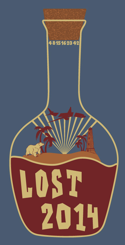
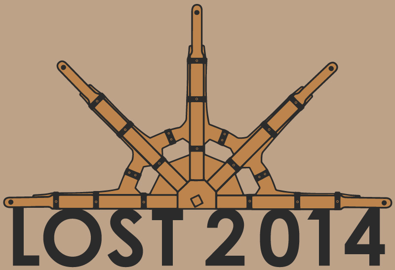
Below are my competition entries for the LOST 2014 logo competition, click on each one for larger versions and underneath each one is a vote link. More Information I had already created one of these images before the competition was announced in anticipation of this moment :-) 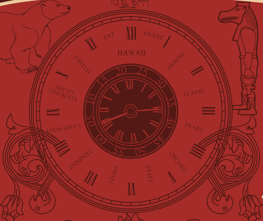 The first one I created was the McCutcheon bottle label design, however the first version had the Ajira and Oceanic airlines logos in the background of the label but as the rules of the competition don't allow them I had to swap them for a polar bear and the Taweret statue. The first one I created was the McCutcheon bottle label design, however the first version had the Ajira and Oceanic airlines logos in the background of the label but as the rules of the competition don't allow them I had to swap them for a polar bear and the Taweret statue.In the center of the label is a watch face and I have altered it from the original to include some familiar names. The second design I created was in response to the competition asking for a "logo" so I decided to strip everything back and just make it as simple as possible, the frozen donkey wheel features in a little more detail with a simple font based statement of the event name. 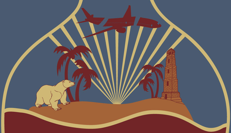 The third design evolved from an idea I had a while ago but never worked on until now. The third design evolved from an idea I had a while ago but never worked on until now.It is of course Jacob's bottle he used to describe the nature of the island to Richard (Ricardo) when he arrived. I decided to include a little diorama of the island and tried a few elements to represent the show. In the end I chose a polar bear, palm trees and the lighthouse, plus light shining out from the swan station hatch and hitting Oceanic 815. (by the way items are not to scale !) 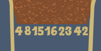 There is also a little whisp of smoke up near the cork trying to escape in the form of the numbers. There is also a little whisp of smoke up near the cork trying to escape in the form of the numbers.The fourth design was a slightly later entry, I had an idea about creating a compass based design like Locke's that Richard shows him when he is young. However looking at images of the compass prop, it isn't that remarkable and looks pretty much like any other compass. So I thought I'd come up with something slightly more original. Although the end result isn't entirely compass like it was the sentiment behind the design. I also made a decision to go for a 1 colour design (1 colour plus a background), around the outside are of course DHARMA station logos. I have had one comment to say it looks like a poker chip design, which I have to agree with, and I'd love to see if this would work at that size. Thanks for reading this rather long post and you can read all about the LOST 2014 Fan reunion by going to the website http://lost2014.com/ |
| << Return to the zort.co.uk home page |


 Why Zort ?